J
Jarret W. Buse
Guest
Linux+: Linux X Window 06 – Fonts
One major aspect of a Graphical User Interface (GUI) system are the letters being used within the windows. Fonts are used for window titles, menu bars, task bars, etc. Fonts can be changed as well as the font aspects such as size, style, color and other items.
Font sizes are usually measured in points. One point is 1/72nd of an inch. To set the font size at 72 points should appear as an inch on the screen as long as the area of the screen is not zoomed.
Fonts themselves come in three common types. The types are:
Vector fonts use curves and mathematical formulas of the placement of lines. Vector fonts provide better looking fonts since the image is not made of individual pixels, but of lines and curves. Since the font is lines and curves they look better when resizing, but still cannot be rotated. Since the font contains mathematical information for rendering the font requires processing. Vector fonts can take some time to render on the screen when used. Typical vector fonts are TrueType (ttf) and PostScript (ps) fonts.
Adobe fonts are split into various types. Type 0 (ocf) is a PostScript font. Type 1 (otf) is a compressed version of Type 0. Type 2 (cff) is used to embed fonts in PDF 3.0 files. Type 3 (ps) fonts are PostScript, but unlike Type 0 and 1, these fonts can use the full PostScript Language. Type 4 is more of an organization of information for the PostScript fonts. Type 5 is like Type 4, but used in a printer's ROM and not as system files. Type 42 is a “wrapper” which is used around a TrueType font.
Some basic font styles are bold, italics and underlined.
Some other font settings which can affect the font appearance are scaling factor, anti-aliasing and hinting.
The scaling factor is setting the basic size of the font. If you want to double the size of all system fonts, change the scaling factor to “2”. It is even possible to make the fonts smaller by entering a value less than “1”. For example, to make the fonts half normal size throughout the whole system, enter “.5”.
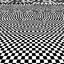
Anti-aliasing is being able to render a high-resolution font on a low resolution monitor. When a high resolution image is rendered on a low resolution screen, there is a visual effect called aliasing as shown in Figure 1. The black and white rectangles should be perfect rectangles and get smaller toward the top of the picture. The image should appear as if the rectangles are going off into the distance, but you can see that the rectangles are rendered incorrectly.

FIGURE 1
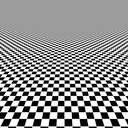
Figure 2 is an image that uses anti-aliasing to improve the quality of the high resolution image on a low resolution screen. The image, of course, is much improved.

FIGURE 2
On some systems, such as a Linux Mint, you can set the anti-aliasing to three different settings:
Another option which a system can enable for fonts is “hinting”. With hinting disabled, fonts will use whole pixels when creating the font character. Each pixel is made up of a Red, Green and Blue sub-pixel. The three colors together allow the creation of all required colors. When turning all three sub-pixels off creates a “black” pixel. With no hinting, whole pixels are used and this can create pixelation. With hinting turned on, sub-pixels are used instead of all three. By enabling hinting, the pixelation affect can be decreased to allow for better readability of fonts.
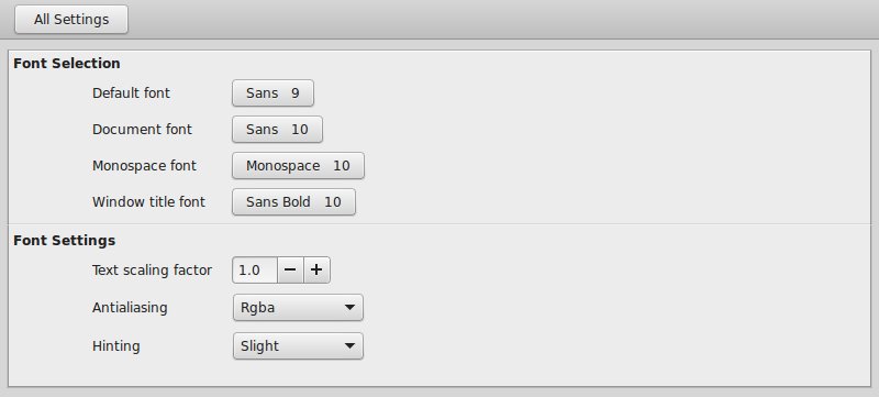
On Linux Mint, the Font settings can be set as seen in Figure 3.

FIGURE 3
One major aspect of a Graphical User Interface (GUI) system are the letters being used within the windows. Fonts are used for window titles, menu bars, task bars, etc. Fonts can be changed as well as the font aspects such as size, style, color and other items.
Font sizes are usually measured in points. One point is 1/72nd of an inch. To set the font size at 72 points should appear as an inch on the screen as long as the area of the screen is not zoomed.
Fonts themselves come in three common types. The types are:
- Raster
- Vector
- Adobe
Vector fonts use curves and mathematical formulas of the placement of lines. Vector fonts provide better looking fonts since the image is not made of individual pixels, but of lines and curves. Since the font is lines and curves they look better when resizing, but still cannot be rotated. Since the font contains mathematical information for rendering the font requires processing. Vector fonts can take some time to render on the screen when used. Typical vector fonts are TrueType (ttf) and PostScript (ps) fonts.
Adobe fonts are split into various types. Type 0 (ocf) is a PostScript font. Type 1 (otf) is a compressed version of Type 0. Type 2 (cff) is used to embed fonts in PDF 3.0 files. Type 3 (ps) fonts are PostScript, but unlike Type 0 and 1, these fonts can use the full PostScript Language. Type 4 is more of an organization of information for the PostScript fonts. Type 5 is like Type 4, but used in a printer's ROM and not as system files. Type 42 is a “wrapper” which is used around a TrueType font.
Some basic font styles are bold, italics and underlined.
Some other font settings which can affect the font appearance are scaling factor, anti-aliasing and hinting.
The scaling factor is setting the basic size of the font. If you want to double the size of all system fonts, change the scaling factor to “2”. It is even possible to make the fonts smaller by entering a value less than “1”. For example, to make the fonts half normal size throughout the whole system, enter “.5”.
Anti-aliasing is being able to render a high-resolution font on a low resolution monitor. When a high resolution image is rendered on a low resolution screen, there is a visual effect called aliasing as shown in Figure 1. The black and white rectangles should be perfect rectangles and get smaller toward the top of the picture. The image should appear as if the rectangles are going off into the distance, but you can see that the rectangles are rendered incorrectly.
FIGURE 1
Figure 2 is an image that uses anti-aliasing to improve the quality of the high resolution image on a low resolution screen. The image, of course, is much improved.
FIGURE 2
On some systems, such as a Linux Mint, you can set the anti-aliasing to three different settings:
- None
- Grayscale
- RGB (RGBA)
Another option which a system can enable for fonts is “hinting”. With hinting disabled, fonts will use whole pixels when creating the font character. Each pixel is made up of a Red, Green and Blue sub-pixel. The three colors together allow the creation of all required colors. When turning all three sub-pixels off creates a “black” pixel. With no hinting, whole pixels are used and this can create pixelation. With hinting turned on, sub-pixels are used instead of all three. By enabling hinting, the pixelation affect can be decreased to allow for better readability of fonts.
On Linux Mint, the Font settings can be set as seen in Figure 3.
FIGURE 3


